Restauranteurs create fantastic guest experiences, serve delicious food and develop creative business ideas with restaurant website design. Digital is a critical component of those business ideas. A website is now the ‘front door’ to a business.
As restaurants perfect their delivery and takeout offerings and digital ordering, it is essential to have a well-optimized restaurant website. It makes it simpler for prospective customers to discover the restaurant online and find what they want.
A website is the foundation of the restaurant’s marketing strategy. Restaurant owners have a unique opportunity to tailor guests’ experiences in-person and online. It builds loyalty and converts casual guests to regulars.
Online research is done by 89 percent of diners before visiting a restaurant. A website is a platform to interact with guests. Whether you hire someone to construct your site or do it yourself, the aspect of most importance in creating an effective restaurant website design is efficiently conveying critical information that entices new customers. Include the following on a restaurant website.
- Basic information, such as hours, phone number, and address
- Links to social media
- Menu spotlight
- Optimal online ordering
- Merchandise and gift cards
- Loyalty rewards
- Email signups
- Enticing photos
- Well-developed text
- Tell a story
- ADA accessibility
- Search Engine Optimization
1. Basic Information

On the homepage, place the essential information front and center. Guests like it to be as simple as possible to find you. Do not make potential customers click around to locate information. List any multiple locations. Besides providing an easy user experience, accurate information on a homepage helps improve Google’s ranking in search results. Make sure your information about locations, hours, and ordering is current.
2. Social Media

Creating consistent branding on social media through email, in-person, or your website is a critical marketing effort. You want to make guests keep in touch with you as efficiently as possible. A simple way is to connect your social media to the website. On all channels, keep social media pages true to the culture, menu, and brand.
The social media strategy must make sense. Fine-tune the content to make it so. Use Instagram for behind-the-scenes shots and beautiful photos. Share updates and promote events on Facebook. Guests use Facebook to find new restaurants through recommendations from friends, research, or Facebook advertising.
It is worth updating a Facebook business page to include relevant information and remain active by sharing updates, photos, and content. Embed social media links on the website to make access easy for guests and permit them to share with friends.
Email marketing is a way to build customer relationships. You want guests to come back over and over. Loyalty signups are an excellent means of gathering customer emails. At every customer touchpoint, include signup prompts.
Those touchpoints include your social media channels, a comment card given after a meal, a line on the check, as guests make reservations, and the restaurant’s website. There is software that grows an email list when guests place delivery or takeout orders or dine in and sign up for a loyalty program. The technology streamlines guest engagement.
Ask for customer feedback and react to it. When you seek customer feedback, they feel valued. It helps resolve grievances and offers insight into the restaurant. Include a catchy call to action to encourage people to connect with social media.
3. Menus

An astonishing 93 percent of customers look at the menu of a restaurant before deciding where to eat. Include your menu on the website. There is a specific way to make it easily accessible. Visitors often view a menu from smartphones. Menus need to be listed on the website and easy to find and share on Google results and a website’s homepage.
Do not ignore fundamentals like adding photos to provide a context of the menu and upsell products. Use HTML rather than an image or PDF for searching. Great menu descriptions are critical for restaurants that have a dish new to customers or an elaborate menu.
Next to the homepage, the menu is the page of most importance. An excellent menu is enticing, usable, and responsive. Online menus have firm requirements. Do not upload the menu as a file or image. It alienates mobile device users and damages search engine rankings because crawler robots cannot read the text.
Re-type the menu into the website so the text can be scaled, moved, resized, and be analyzed by search engines. Do not bury pieces of a menu behind clicks or separate parts of the menu in tabs. It is frustrating to click back and forth between sandwiches and appetizers.
The menu should be visible on a single page without clicks. Customers expect to scroll, and that is acceptable. The ability to scroll is of importance to mobile devices where clicking slows down the process.
Straightforward navigation is more user-friendly than something more challenging and complex for visitors to use. Ensure you have clear menu categories, such as Drinks, Beverages, Main Course, Non-Veg, and Veg.
4. Online Ordering

Approximately 82 percent of guests prefer ordering directly from the website of a restaurant. That preference is a win for restaurant owners. Make sure ordering from the menu is easy for guests. Showcase the menu and point visitors to the site to information they may need while integrating the website with such technology as reservation and ordering software.
If you offer online ordering, it is advised to have a separate menu for ordering online. A prominent ‘Order Online’ button on the homepage directs guests to the online ordering page. An online ordering button provides an opportunity for website visitors to convert to buying customers. There may also be links to make reservations and order food on a page with directions on how to get to the restaurant.
5. Merchandise and Gift Cards

Merchandise and gift cards are easy ways of driving revenue. They are ways loyal guests show their love for a restaurant. Gift cards serve as a micro-loan for cash flow. You can rely on the customer coming back.
Promote gift cards prominently on the website to make it easy for guests to find the cards and order online. Restaurants that closed their doors due to COVID began selling merchandise. Examples include special nuts, granola, teas, caramels, and clothing.
6. Loyalty Programs

Loyalty programs turn casual guests into regulars. Besides gift cards and online ordering, have a conspicuous prompt on the website to sign up for loyalty programs. Tailor the program to the concept of the restaurant.
Reward guests for such things as their tenth visit or ordering some item on the menu ten times. Guests accrue points whether they order online or dine-in. Linking loyalty accounts to guest’s credit cards make it easy.
You can combine email and loyalty. Use insights from customer loyalty analytics to send targeted campaign emails to those close to points that earn a reward. Guests get excited about a strong loyalty program. They order again to redeem points for the discount. Continue to target guests with gift cards, discounts, promoting repeat visits, segmented email campaigns, and more loyalty points.
7. Photos

Imagery is an effective way to send messages about a business to prospective guests. Photos convey what to look forward to when they order online or come to a restaurant. If you evoke a pleasant response from visitors to the website, you have won them over.
Combine your website photography and social media strategy into a great Instagram campaign. Guests share photos of the food with a tag for the restaurant. Their images build an online gallery for the restaurant website.
A website is a customer’s first impression of a business. Make it ideal. You have a competitive advantage. The best tool for digital marketing is high-quality photography. It says a lot about the style, price range, staff, food, and atmosphere.
The homepage will likely contain the most photos. Other pages incorporate photos but probably have more text. They may include pages linked from the navigational menu that includes the names, descriptions, and prices of dishes.
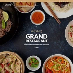
A large photo used as the background image of the introduction is ideal. Do not be afraid to showcase a cute storefront in the nice part of town. Use an interior shot if the restaurant looks best inside. If the space is not the best feature, lead with beautiful food instead.
Feature a nice kitchen and a charming staff in behind-the-scenes shots. A high-quality visual, such as a video background of food being prepared, produces the best appeal. The strongest imagery should be used first, followed by other images lower on the web page.
Professional photos do not have to be expensive or difficult. Build a lightbox with some tissue paper and cardboard. Putting food in the lightbox and taking smartphone camera images provides incredible results.
8. Text

There is no need for extensive copy in a restaurant website design to convey the core message to visitors. Minimal text supported with excellent images does a better job of getting across the message than excessive text. Starting with a big paragraph overwhelms the reader.
Showcase what has gained your reputation and bring the ideas across by using images. Try to avoid an overload of information on one page—separate content into ‘buckets’ that link each page in a sensible, transparent manner.
The fonts chosen depend on the mood that you are trying to set. Block texts look odd in a frilly or fun layout. Cursive does not fit a professional tone. Most text fonts are either serif or sans serif. The small lines and strokes extending from the ends of serif font letters are perceived as more conservative and warmer than sans serif. Both can be decorative, plain, basic, or modern. The final choice needs to be compatible with different browsers and legible on multiple devices. If it is not, people do not stay on a website.
9. Tell a Story

Telling a story is an excellent way for people to learn about the concept of a restaurant and what the business represents. Telling a story helps connect with people. A website is the ideal place to showcase the history and personality of a restaurant. Are local farms your source of produce? How did you choose the name of the restaurant?
Have an ‘Our Story’ or ‘About Us’ section on the website that answers questions like these. Authenticity is extremely valuable in advertising. It is a reaction to the shallow, fake brand identities from the past ten years.
Show customers how the restaurant came about and what makes it unique by talking about
- When it was founded
- Where the food comes from
- How it is prepared
- What was the inspiration for the menu
- Who is the chef
- Who makes up the core team
A website is an opportunity to highlight those things that make a restaurant special. It can be things, such as the chic atmosphere, finest eggplant parmigiana, a prestigious wine list, or five-dollar appetizers. If you struggle to articulate a restaurant’s unique qualities, consider these questions.
- What is the favorite dish of customers?
- What does your restaurant offer that your competition does not?
- What does the atmosphere represent?
- How do your employees describe the food?
10. ADA Accessibility

Before you launch a website, be sure it is accessible to all potential guests. ADA accessible websites have the following
- Images that contain alternative text that provides text descriptions for page images that aid those who are visually impaired
- Have form labels for screen reader users that interpret and interact with the fields of a form
Make the website accessible to every guest that wants to make a reservation, order online, view the menu, find your location, or use any other function available. There are ADA compliance guidelines for websites.
11. Website Customer Base Issues

When you start to build or redesign a restaurant website, keep in mind who you are trying to entice before creating the design assets of the site. The nature of beverages and food business online means new and existing clients require serious thought regarding the best way to engage with them. Website customers usually fall in one of these categories
- Returning customers
- New local patrons
- New from out-of-town patrons
Think about the needs of these groups when building an online presence. When new local customers shop around for somewhere to eat in advance, they compare websites for restaurants in town. Tourists likely research on a mobile device from a motel room.
Having a mobile-friendly website is critical in earning their business. The mobile version should feature a concise message enhanced with imagery to stress critical points effectively without boring or overwhelming the user – especially on small screens. Look at multimedia elements, on the mobile version and consider alternatives for elements that slow website loading time. Not everything suited for a desktop version fits the mobile version.
The best-looking websites have the most appeal. If searchers visit and enjoy a restaurant, the owner has won a referred or repeat business. A website is a vital component of a marketing strategy. It ranks in importance with location and street presence.
Returning customers look for the fastest path to a phone number to make a reservation or place a takeout order, for directions, or a menu. Be sure not to bury information behind multiple clicks. It should be quickly accessible.
A welcoming atmosphere, clean tables, and excellent lighting are of importance to a physical location. The same is true of a website. People who visit a website are visiting a virtual space. They judge the quality of the location, food, and service based on the site’s presentation. Highlight multiple subjects, such as chefs, plating, interior, and street level. They all appeal to different types of guests.
A clear message is not only of importance for search engines. It tells people about the restaurant’s food and mission. Different types of information cause reactions from different people. High-quality images appeal to most visitors. Do not neglect readers.
Having textual and visual information engages both sides of the brain. They leave a strong impression. State the type of restaurant clearly. Write ‘Authentic Thai Cuisine’ if the restaurant serves Thai food. Use a large font on the top of the introduction image.
Something so simple is often overlooked. It must capture a user’s attention in less than five seconds. Your website will drive sales if you get them to read the type of restaurant and see a beautiful image. More detailed information is provided below the introduction in the body of the homepage.
An advertising principle addresses multiple types of appeal. People respond to a website based on the appeal to utility or emotions. The price of a meal or speed of service has a utility appeal. Whether food is locally or ethnically sourced is an emotional appeal. Use content that resonates with different personalities.
12. Tracking Visitor Behavior

To know if a website is performing and generating sales, implement Webmaster Tools and Google Analytics. Webmaster Tools tells which keywords are entered by users into Google to find the website and how those keywords rank compared to the competition.
The information helps refine the message to obtain more visitors with the keywords of high value. If people search for ‘Asian Cuisine’ more often than ‘Chinese Food,’ refine the content to align with the keywords ‘Chinese Cuisine’ to help rank higher and increase traffic, which translates to more business.
13. Search Engine Optimization

A well-designed, gorgeous website is of little use if customers do not find it. That is where SEO comes into play. Doing Search Engine Optimization for a restaurant website design means the restaurant appears high in Google rankings and is seen be those searching for something relevant to the restaurant. If someone searches for shakes and ice cream near them, ice cream parlor websites appear on the first Google page.
14. Consistent Restaurant Design and Theme

Because a restaurant website is a restaurant’s virtual face, it plays a critical role in maintaining the brand and online presence of the restaurant. The website must reflect the concept and theme of the restaurant brand.
Be sure the restaurant logo can be seen on the website. The website should follow the theme and color scheme of the restaurant. An appealing restaurant website design used to enhance the online business pays enormous dividends when done correctly. It substantially helps increase the online return on investment.
When creating a restaurant website design, the fonts, colors, and layout need to be based on how they make users feel. The feeling impacts how they think about the restaurant. It is often a visitor’s first impression and determines whether they will patronize the business.
The correct design helps potential and current customers easily and quickly find details about the restaurant and menu, reach out via social media or email, and get a sense of what the restaurant offers. You may have some goals or ideas of what you want a website to accomplish.
It all boils down to the experience offered to the visitors. If the goal is to accept online orders, focus on converting orders. A plan to increase in-house traffic should deliver an experience that pushes visitors to the restaurant in person. Every restaurant website differs due to the goals that have been set. There are some common elements.
The colors make diners feel hungry, sensual, excited, or calm. Colors also impact readability and response rates. Keep functionality and aesthetics in mind in the choice of the color scheme. If you are not sure of the colors to use, begin with the restaurant’s color scheme and create a consistent experience from frame to the table.
It helps to keep the brand consistent and ensures guests that they came to the right place when they visit the restaurant. Colors that positively impact appetite are yellow and red. Avoid appetite-killing colors, such as purple and black.
The text needs to be readable without causing strain to the eyes. Schemes that work are a dark background with light text or vice versa. Avoid text and links in neon colors. They tend to annoy visitors.
15. Consider Hiring a Professional for Your Restaurant Web Design

The restaurant website design involves a lot of work. A professional design agency handles everything from taking professional photos of the food and restaurant to building a website that appeals to new customers and delights regulars. Websites are the most vital marketing campaign component. It needs to be done correctly from the beginning to ensure success. Find a digital agency partner to create the best presentation possible.
Recap
There is no end to the opportunities people have for delivery and takeout. Your brand should attract guests and keep them coming back. The brand is more than a font or logo. It is how owners express themselves, what they stand for, and what guests can expect from it.
It extends beyond the walls of the restaurant. An online presence reflects a unique positioning at all touchpoints. A guest who researches for you online is equivalent to someone who walks in the restaurant’s front door.
Create a consistent brand experience from end to end. Social media, email, in-person contact, and a website play critical roles in your marketing efforts. A restaurant owner needs to be aware of the variety of ways to harness the market of potential customers. Following these tips makes a restaurant website a success.


