Strong marketing is a significant part of a successful restaurant business. The marketing plan has two components – getting people into the restaurant and getting them to order food. A restaurant menu design plays a role in both parts.
One of the most daunting things a restaurant must do is create or change a menu. It is the menu that brings in customers and keeps the lights on. The perfect array of dishes involves some trial and error. This article focuses on the issues involved in the best menus design strategies.
Menu design is almost a science. Studies have been conducted about what people search for when they open menus and how they should be organized and designed to get the best results. The following are simple steps for giving a menu a makeover and making it more effective. It contains some tips on how to get it right from those having experienced success in creating or changing a menu.
1. Consider the Location

Among the most crucial steps is thinking about the location of an eatery, café, or restaurant. What do people in the area like to eat? Consider what’s currently popular and where those niches are. What is the socioeconomic status of the area?
According to Conrad Hector from Duck Duck Moose, ‘You want to be affluent without alienating customers.’ You want something exciting and different that attracts a variety of people. If you are in an area with shops serving fish and chips, look for fresh, gourmet menu design items. Look for something enticing and exciting. Homing in on the audience is essential. A holistic approach to restaurant menu design considers the type of customers and location that fit the menu.
2. Choose a Theme

The menu choices and the feel of the restaurant should match. Every restaurant has an atmosphere, style, and theme. Matching the menu to the ambiance is of importance. There is some room for flexibility, but you don’t want to defer or confuse potential customers. Find a balance between the different and the classic. Customers have a great deal of control over your success. Pleasing them is as essential as serving what you love.
3. Be Flexible and Change Frequently

The first menu design ideas should not be the last. Even if the restaurant menu design seems ideal, it allows room for change. Try new things and alter things that don’t work. An excellent way to discover what does and doesn’t work is by changing the menu regularly.
It also builds excitement for guests. Some successful restaurants change menu design ideas monthly, others seasonally. Establish a schedule and adhere to it. There is no need to change everything. Keep the best and add new items to the mix.
4. Keep the Menu Small

An extensive menu causes indecisions and can result in guests leaving. Lots of choices are frustrating and confusing for customers. Ultimately, it results in a decline in profits. A simple menu is easier for everyone. Guests like it, there are not as many products to buy, and chefs focus on quality instead of quantity.
5. Test Menu Items as Specials

Specials are an excellent way for restaurants to test and learn. They provide the opportunity to see what customers like before adding them as a permanent addition. You discover what to keep and what needs to change the next time you refresh the menu. You know what trial items worked.
6. Signature Dishes

A signature dish showcases the restaurant’s style and the chef’s talent. It is the item that draws customers to the restaurant and what they talk about when they leave. All dishes should be worth remembering. The signature dish should be the jewel in a crown of delicious dishes.
7. Price the Menu Appropriately

Many factors have a role in pricing menu design ideas. Take into consideration all that affects the profit margin and charge accordingly. Groceries and staff are only a scratch on the surface. Equipment, utilities, rent, and breakage are some of the incidental outgoing costs.
Pricing also involves some trial and error to figure out how much to charge. Look at your competition and customers when considering price points. It may be necessary to mix up the restaurant menu design when pricing. Not all dishes yield an equal amount of profit. Some are positive, others negative. You can maintain food cost goals by balancing items that do and don’t yield the same profit.
Focus on what is offered rather than how much an item costs. Promoting cheaper items or dollar menus typically does not work to a restaurant’s advantage. Decrease the font size for prices. Keep the size uniform with the descriptions or smaller. Take out the dollar signs to remove the focus from the price. The goal is to have customers make selections based on what looks and sounds good, not the cheapest items.
8. Make the Restaurant Menu Design Engaging and Attractive

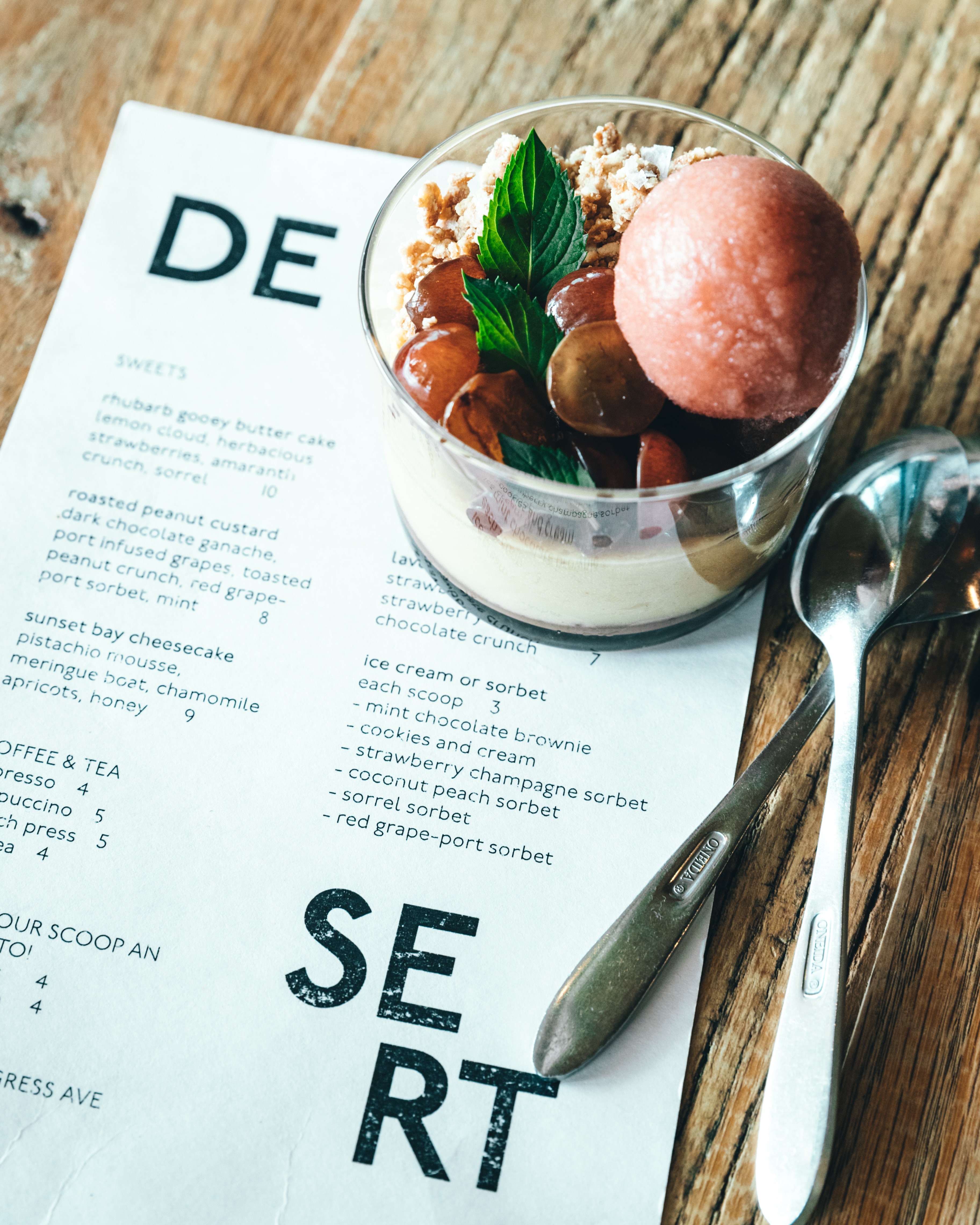
The menu design has nearly as much impact as the dishes. The visuals and colors, the feel and shape of the menu, and where items are placed affect how customers use it. Where dishes are placed, and the size of the menu are important.
Items at the beginning and end of smaller menus are typically the most memorable. A4 books denote the size of menus used in venues, such as pubs. They’re easy to hold and read and stand up on the tables.
Some restauranteurs make the mistake of highlighting dishes that aren’t doing well and forego promoting the best-selling items. Promoting the most popular dishes keeps people coming to a restaurant.
They come back for their favorite dishes and eventually try something else on the menu as well. Place the most popular choices within the first two or three selections in a category. If you box items on the menu, box those that gross the most and are popular with your clientele. The best-selling dishes should get the most attention.
Be specific when naming the menu categories and sections. The headings ‘Breakfast’ and ‘Entrees’ do not offer the same information as ‘Omelets,’ ‘Sandwiches,’ ‘Pastas,’ and ‘Burgers.’ More specific descriptions make it easier for customers to choose what they wish to eat. Keywords help bring sections of the menu to the attention of the customers faster.
Studies show the use of icons and symbols helps draw attention to menu items. You can also use them to improve the general menu design and make it easier to read. A star denotes the menu item is either a popular item or very good.
Symbols can be used to show items that are vegan or vegetarian menu items. You don’t have to create a special section or write it out. Avoid using the heart icon. It is equated with healthy choices, which translates to customers it is tasteless and bland.
‘Less is more’ is true when describing menu items to customers. Rather than mentioning every ingredient, write an adjective-filled description worthy of magazine reviews. They should be to the point and short in length.
Hire a copywriter to help with the descriptions if you can’t write an enticing description with the fewest words possible. Many restauranteurs feel it’s necessary to use every inch of the menu. Having some empty space makes the menu less busy and more readable.
The same is true of pictures. A great picture of some main dishes is an excellent idea. There is no need for photos of every item on the menu. The pictures should be taken by a professional, not something a server took on a smartphone.
Use inserts to keep customers interested in the menu. It is among the best means of marketing new additions to the menu or further promoting popular dishes. New inserts let customers know you try new things and refresh your offers.
They give the server a topic to talk about when they greet customers. Inserts provide a way to test items new to the menu. Put new dishes on inserts and have servers mention them. It helps gauge how well a dish is doing. You can decide if it is something to include on the main menu.
9. Choose the Proper Ingredients

Ingredients vary based on the clientele and location. Some key points maximize profit and minimize waste. Reduce waste by serving dishes that have several ingredients in common. Crossing over produce reduces cost and waste.
Less equipment, prep, and waste equal better profits, prices, and customer service. Using less red meat keeps costs down. Reducing protein also reduces cost. Compensate by having weekend specials that feature red meat and expensive produce.
Recap
Like most marketing aspects, the best menu design is something that is a continuous work in progress. You must constantly tweak the restaurant menu design and try new things, keeping track of what you discover to achieve the best results.
Not every technique works in every establishment. You find what works for menu design ideas, style, and clientele through trial and error while keeping costs low. The management of a restaurant can be extremely rewarding and overwhelming. Use these tips to cash in as soon as possible. They take profitable planning to the next level.
